Saturday, 4 May 2013
Welcome Moderator
Welcome to my blog for my A2 Media Studies. The first three posts on this blog, are my finished products, and at the top of the blog you can find my four evaluation questions.
Saturday, 6 April 2013
CONSTRUCTION: Finished Music Video
Here is my finished music video for My Rock N Roll by Dinosaur Pile Up
Thursday, 28 March 2013
CONSTRUCTION: Finished digi pack
Here is my finished digi pack. I made my design very typical of Dinosaur Pile-Up's style, so that fans of the band will instantly recognise it as theirs before they have even read the text. Dinosaur Pile-Up also have a different dominant colour for each album, and blue is a colour they have not used yet. I also took the lightning bolts and used them on the inside covers since they are very eye catching and are a definitive part of the bands logo.

CONSTRUCTION: Final magazine advert
Here is the finished model for my magazine advert. After gaining some feedback I was told that the previous model looked a little unprofessional and random in the placement of the text. So, I researched into other magazine adverts to try and identify more codes and conventions that I could bring over to my advert.


Sunday, 17 March 2013
RESEARCH: MAGAZINE ADVERTS


These are some examples of magazine adverts for Dinosaur Pile Up and a band that are closely associated with them, Pulled Apart By Horses. Dinosaur Pile Up don't have any magazine adverts for albums, so I used an advert for their most recent tour instead.
Thursday, 14 March 2013
CONSTRUCTION: FINISHED ALBUM FRONT COVER
Here is the front cover for my album. I have tried to keep it as similar a design to previous Dinosaur Pile-Up records, because the design is recognizable to fans.


- One single background color with a little texture/noise.
- Band name as a header and the album name as the footer.
- Central image of the lead singer.


Tuesday, 12 March 2013
CONSTRUCTION: First draft for magazine advert
Here is the first draft for my magazine advert. I have made the design extremely similar to the album cover, so that people will be able to identify the album just from looking at the advert. I have also included tour dates, because fans of bands like Dinosaur Pile Up may be more encouraged to buy the album if they feel they have the opportunity to see the band live.


Monday, 11 March 2013
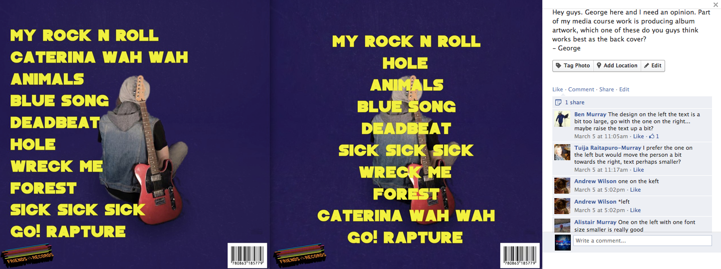
CONSTRUCTION: RECIEVING FEEDBACK
When making my back covers, I had two ideas in mind but wasn't sure which one to go for. So, I produced a version of each idea and then posted it online to see which one people thought worked best. The feedback that I got was that the one on the left would work best if the text was made smaller. So I listened to this feedback and did just that.


Friday, 8 February 2013
CONSTRUCTION: GLIDE CAM FOOTAGE
 | |
| Glide Cam. The camera sits on top while the weights on the bottom balance it out so that the footage is nice and steady |
Tuesday, 5 February 2013
CONSTRUCTION: FONTS

 I did some research into possible fonts I can use for my album cover. For the band name, I will keep the same logo which includes the name as the band have always used, because it is an integral part of the band's identity. For the album name and track listings, I will need to find a font which is as similar to the one used in the logo as possible, because using the same font is something that Dinosaur Pile Up do with all their albums. So, I went onto dafont.com and downloaded these fonts

Wednesday, 23 January 2013
Exam question: Narrative
For our movie opening (AS course work), narrative plays a key part. During our film opening, we are introduced to our hero, and a potential heroine (the hero's girlfriend). The heroine however, is killed of/hospitalised in the opening and we are shown that the hero blames himself because in the next scene, we see the hero on top of a building and we can hear his thoughts, such as "why did you do it?" and "its all your fault". The audience are then led to believe that he kills himself by jumping of the building, but we don't actually see him falling so this is left to speculation.
The whole point of our film opening, was that it was meant to act as a prologue to the rest of the film, so if the audience are unable to follow the narrative in the opening, they are unlikely to understand the narrative in the rest of the movie. Because of this, we had to make what was going on extremely clear, while leaving some questions unanswered which help to set the scene and are to be answered in the rest of the movie (e.g. does he actually die? How did his girlfriend get hospitalised?). One thing we realised after watching our raw footage back for the part where the boyfriend is standing on the roof after his girlfriend has been hospitalised, was that it was unclear from a narrative point of view that he blamed himself for her death. So, to solve this problem we went into the music tech studio and recorded some phrases that we could use as thoughts in his head such as "why did you do it" and "its your fault" to make it clearer for the audience.
We also used colour correction to help make the narrative as clear as possible. For example, in the scenes where the boyfriend and the girlfriend are happily together, we colour corrected the shots to make them look brighter, bringing up the white balance. Whereas, in the scenes where the boyfriend is alone, we colour corrected the shots to make them look darker (reflecting his mood).
Another affect we used to make the narrative clear, was the blur we used in the scenes where the boyfriend and the girlfriend together. This effect, means that everything in shot but the boyfriend and girlfriend are blurred, literally putting them in their own little bubble. This reflects how they are in their own world when together at this point in the narrative and it emphasises their happiness.
The transaction between where the boyfriend was with his girlfriend, to where he is no longer with her, is also a key point in the narrative. We made this transaction by showing a flickering picture of an ambulance, followed by a reverberated sound of slamming doors. This slamming of doors, also helps to metaphorically "close the door" on the last part of the narrative.
Our opening follows Roland Barthe's Hermonutic code, meaning that there is an element of our story that is not fully explained and from then on becomes a mystery to the viewer. In our case, we do not know how the girl was hospitalised, or if the boyfriend dies. This will keep the audience guessing and trying to put the "pieces of the puzzle" together before all is revealed in the final few scenes of the movie. It keeps up the intrigue and suspense.
Tuesday, 22 January 2013
CONSTRUCTION: ALBUM COVER
I have started finalising what I want to do with my album cover for My Rock n Roll. I have identified a trend in Dinosaur Pile Up's albums, which is that they have a simple, central image on a single stock colour background which changes with each album.
They also use the same font for the band and album name, positioned in the same place. This makes their albums easy to recognise.
Because of this, I am going to organise a photo shoot of myself on a coloured background, since Dinosaur Pile Up's album covers always feature the lead singer (who is in this case myself). I will organise this using Facebook with one of the photography students at Claremont.


CONSTRUCTION: ORGANISING USING FACEBOOK

Monday, 21 January 2013
PLANNING/RESEARCH: Launching my album

The gig was a "secret" show, meaning that the only way to find out about it was by finding one of the small cards that you were able to pick up in Banquet Records (record store), who were organizing the event. Because of this, the gig was small and very intimate, although the club was full there were only a few hundred people and Lostprophets are usually able to sell out massive venues that hold thousands of people like O2 academies.
Small gigs like this help the fans to feel special and connected to the artist, although not many people are able to get tickets, people who are able to go will grow to love the band even more and even those who don't get to go will be immensely jealous. In effect, its just for creating a buzz. I would plan to have a launch party for these reasons
Sunday, 13 January 2013
Digi pack research
In this blog post, I will be posting all the research I have done into digi packs and album covers. I will be identifying what I need to do to make my product marketable and eye catching etc, and will therefore make it sell.


Conventions of an album cover

- Although there may be multiple things going on in an album cover, one particular thing will always be the centre point of the cover. This picture should also help the audience to get a feel for what the album's contence will be like, and the picture will often (but not always) go with the album title. For example, in A Day To Remember's album "What Separates Me From You", there are various things going on in artwork, but the main image is defiantly the man stuck in the hour glass, being literally "separated" from everyone else. We know it is the main image because of its large, central position.
- Because of the album title and cover, we should also be able to make an assumption of what the album will be like. For example, with "What Separates Me From You", we make the assumption that the album will be about isolation and a sort of "us against the world" kind of vibe (which it is).
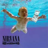
- Another thing to consider is the font used in an album cover. Nirvana, have use the same font for their band name on every official album they have ever made and because of this, people not only recognise the band name, but also the font, making their albums stand out even more.
- Nirvana have also used shocking imagery to sell their albums, none of which was more successful than the artwork on their breakthrough album "Nevermind". The artwork on this album freatures a uncensored, naked baby, swimming after a dollar bill. This caused a fuss because of the uncensored private parts of the baby, and because of how the baby swimming after a dollar bill was making a statement about peoples obsession with money.


Subscribe to:
Posts (Atom)